mediaBASE Quality Management Portal
Help to ensure that media assets meet the quality requirements and support our retail partners’ marketing measures. Only media assets that fulfil the quality requirements can be made available via the Markant mediaBASE. Here we provide examples to explain potential deficiencies and give you tips on how these issues can be avoided or rectified.

Hints for the submission of assets to the Markant Group
Assets– Technical Requirements
Based on the GS1 application recommendation and the requirements of the retail partner
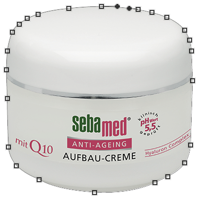
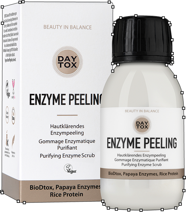
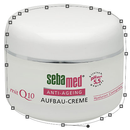
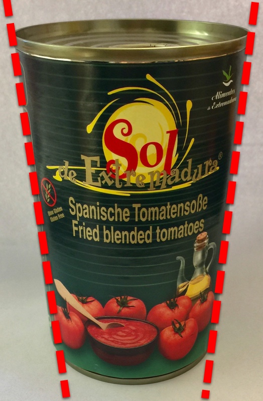
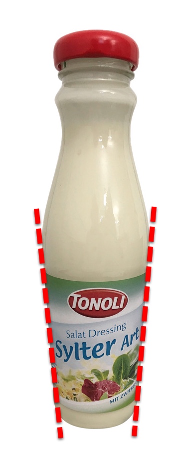
Clipping path
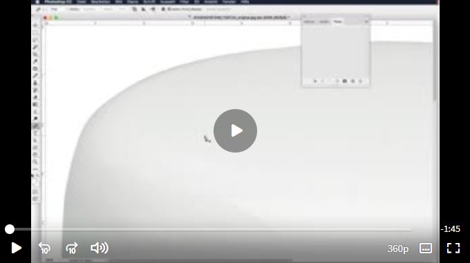
- To enable increasingly automated processing, one activated clipping path must be created with the title “Path 1” .
- No value should be set for the flatness value.
- The clipping path should be created using only clipping tools (pen tool) in Photoshop.
- The number of anchor points should be as low as possible.
- The clipping path must be closed.
- Before saving, check the path name in the path window. This must be saved as a clipping path. The clipping path name is shown in the path window in bold.
- Paths may not extend beyond the outer edges of the motif.
- Superfluous clipping paths must be removed.
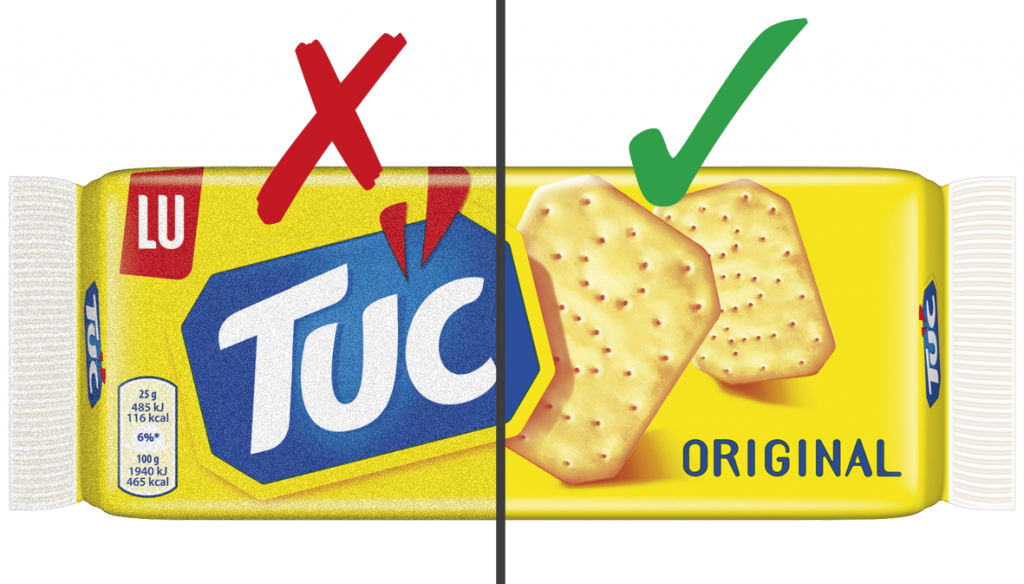
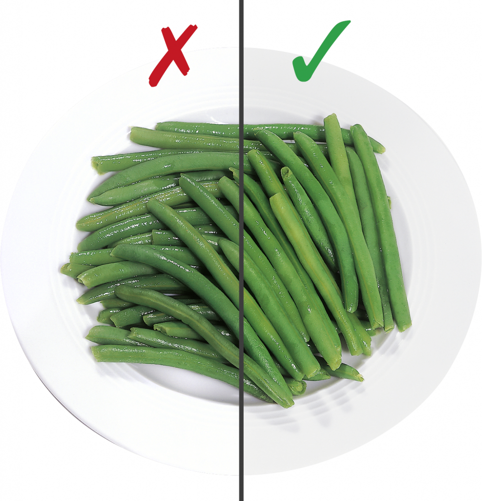
Inadequate knockout or clipping path
In digital image editing using Photoshop, knocking out is one of the most frequently used processes. Knocking out means removing unneeded image information, such as backgrounds or other objects, from the image or photo so that only the desired elements of the image remain. This process has a wide range of practical applications, from isolating products for catalogues to cutting out hair in portrait photos.
Clipping path missing
Knocking out means providing the image without a background (motif only) so that it can be placed on a coloured background, for example. The clipping path is needed to generate transparencies automatically – conversely, this is only possible with losses, leading to a poor knockout.
Example:
Clipping path missing
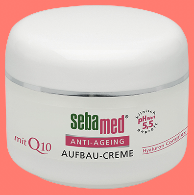
Correct clipping path

Examples: Inadequate knockouts with a transparency or alpha channel
Transparency
Alpha Channel
Clipping path poor
A poor knockout means that the image can only be shown with a poor presentation, e.g. on a coloured background.
Example: correct clipping path
The clipping path has been created using the pen tool in Photoshop.
Examples: poor clipping path
The path has been moved
The path is angular

Clipping paths created automatically
with the “magic wand”

Inner area not knocked out
Clipping path is not complete

Image Quality
- No distortions, e.g. wide angle images, moiré
- Pay attention to the neutral backgrounds on transparent packaging
- Optimum image definition
- No pixel formation
Note: To optimise image quality, see Photo briefing
Poor image quality
To ensure optimum presentation of a product, marketing and advertising departments need photographic material that is suitable for appealing print campaigns as well as online shops and other online projects. Below we provide examples of potential issues and provide concrete information on what you can do to prevent these issues.
Image resolution
Pixel dimensions measure the width and height of an image in pixels. Resolution is the fineness of detail in a bitmap image and is measured in pixels per inch (ppi). The more pixels per inch, the greater the resolution. Generally, an image with a higher resolution produces a better printed image quality.
Image resolution too low
If the asset image resolution is too low, the quality will be too low when they are displayed in larger sizes. Please refer to the quality standard requirements.
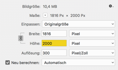
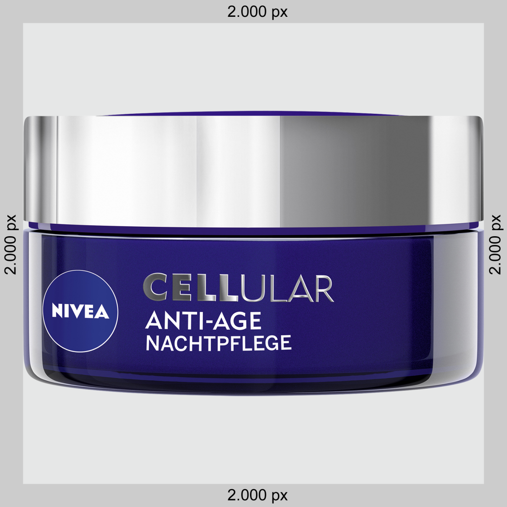
According to the Markant mediaBASE quality standard, the longest side of an asset must measure at least 2,000 pixels.
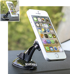
Image size
The effective image size is crucial to the intended use. Images that comply with the suggested sizes are displayed without problems in advertising brochures, flyers and on mobile, for example.
Image size too small
If the image size of assets is too small, the quality will be too low when they are displayed in larger sizes. Please refer to the quality standard requirements.
According to the MARKANT mediaBASE quality standard, the longest side of an asset must measure at least 2,000 pixels.
Color cast
Incorrect colour reproduction in which an unwanted tint dominates the whole image. Colour cast is particularly easy to identify on a white section of the image.
Example: Effect of colour cast (blue tint)
Example: Motif with yellow tint
Incorrect image. Clearly visible yellow tint
Corrected image without yellow tint
Example: Motif with red tint
Incorrect image. Clearly visible red tint

Corrected image without red tint

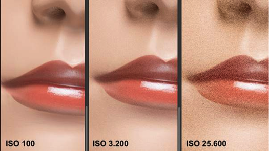
Coarse grain / image noise
Image noise is a fundamental technical problem in digital photography. Image noise occurs mainly in very dark areas of an image or in very poor lighting conditions. When printed, this effect translates to unclear images and a loss of detail. In the time of analogue photography, this effect was referred to as “grainy” and was particularly common in exposures with a high ISO number.
Examples: Images with image noise
Useful information from external sources
Poor contrast
Contrast is a value measuring the difference between the lightest and darkest areas in an image. If the difference in brightness between these areas is not sufficient, the contrast is too low and the image looks dull. If the difference in brightness is too great, the contrast is too high.
Example: Poor contrast
“Dull” image
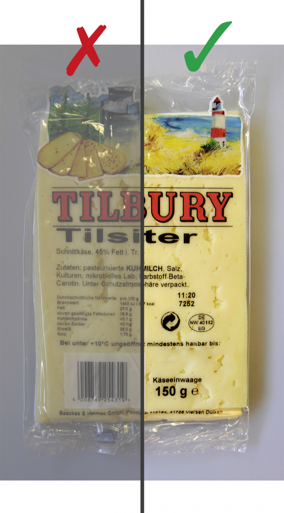
Image “too bright”
Useful information from external sources
Unclear
The ease of discerning details in an image is known as sharpness. Sharpness is one of the most important technical objectives in photography.
- If sharpness is a physical feature of an image, we talk of sharpness.
- If there is only an appearance of sharpness, this is known as an impression of sharpness.
In everyday photography, sharpness is only of secondary importance. The impression of sharpness plays a key role in assessing the quality of a photo.
Examples: Unclear images
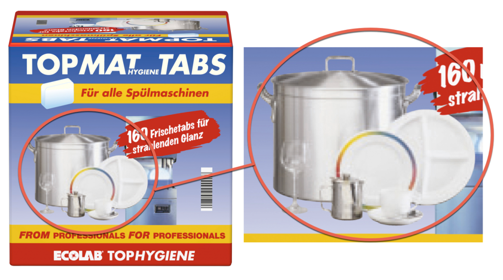
If a pixel graphic or sections of a pixel graphic are enlarged, the individual pixels are also enlarged. The further the image is enlarged, the more rough, angular or “pixelated” the image will appear.
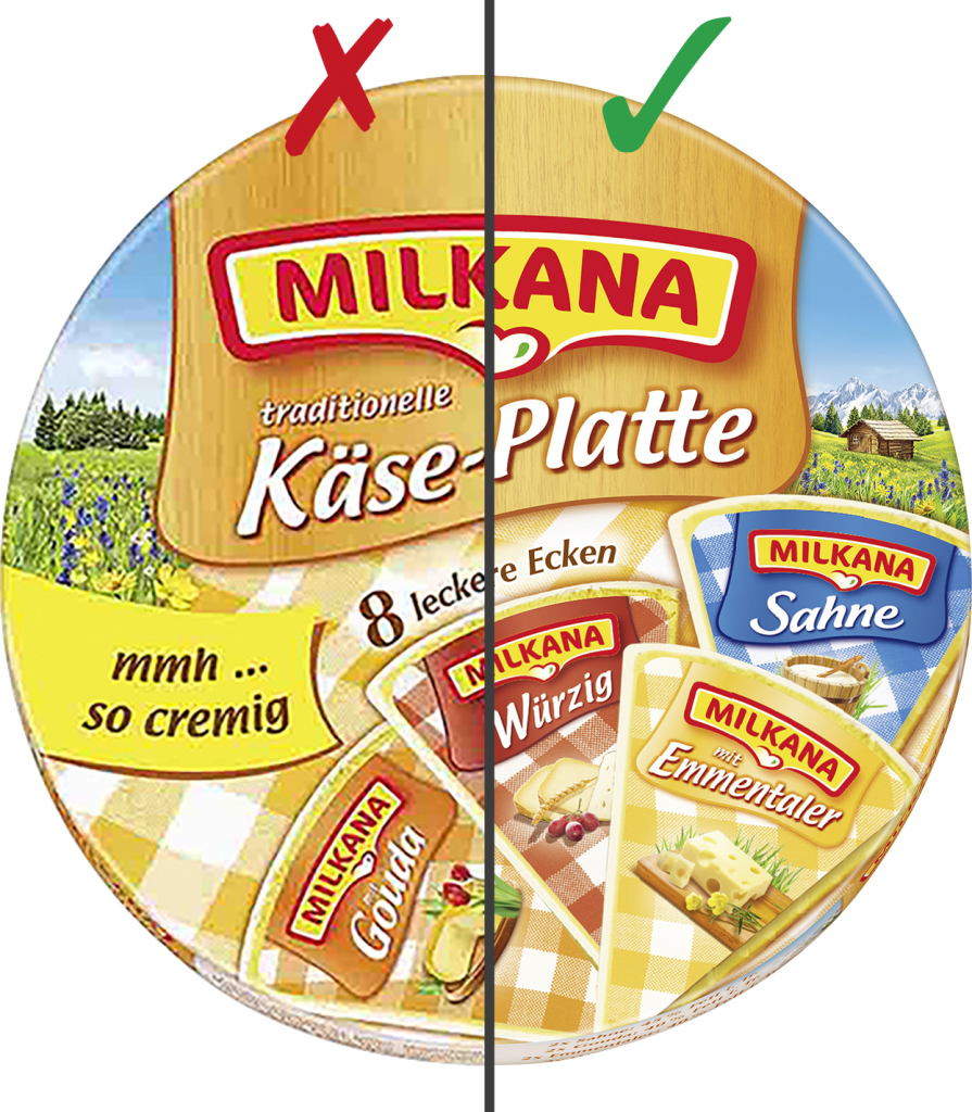
Examples: Pixelated images
Round icon pixelated.

Image of pots and plates on the packaging pixelated.
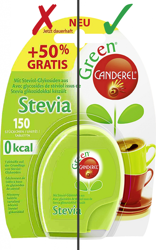
Overly compressed
Compression involves reducing the volume of data. We can differentiate between lossless and lossy compression.
- Lossless compression reduces the file size to half or one-third of the original size. Data created using this method is not generally universal – special software is needed.
- Lossy compression can reduce the file size to as little as 5% of the original size, which is made possible by deleting non-dominant image information. The files created are universal and can be used with most computer programs. Lossy compression always involves a loss of image sharpness.
Examples: Overly compressed images
Data format
Preferred image format:
- JPG format with maximum quality (Photoshop stage 12) incl. clipping path
Alternative image formats:
- TIF format (LZW compression) incl. clipping path
- EPS format (JPG compression, maximum quality) incl. clipping path
Inadequate data format
In most cases, data provided in an incorrect file format cannot be used. Below you will find explanations of specific problems relating to data provided.
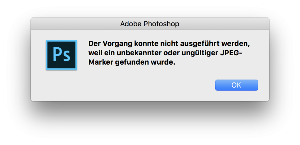
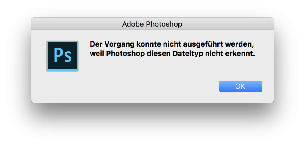
Damaged file
BIf files become damaged due to an incomplete file transfer or an error when saving they can no longer be edited.
Error message examples
Incorrect file format
Image-editing programs can load and save a range of file formats. Each file format has its own features and is suitable – or unsuitable – for certain applications. A file format can be selected when saving an image file. The file must be given the right extension, or a compression must be specified.
Please supply the file in a format that complies with the media assets quality standard
Preferred file format for logos/labels:
- Vector formats (Adobe Illustrator)
- Adobe Illustrator “.eps” or “.ai”
Linked images and fonts:
- Fonts must be converted into paths
- Images must be embedded
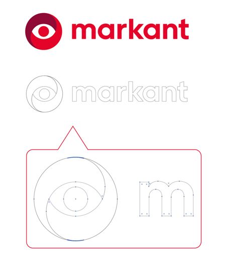
No vector file
In a vector graphic, the image is composed of geometric forms such as lines, circles and curves. The image displayed is mathematically defined using these geometric forms. This means that a vector graphic can be enlarged (scaled) without any loss of quality, since the image is recalculated each time.
Example: of a vector file
Bitmap vs vector

The logo on the left shows a bitmap file that has been enlarged by 250%. The edges are unclear and stepped.
The logo on the right shows a vector file that has been enlarged by 250%. The edges are clearly defined and sharp.
Font not converted
To avoid errors when the image is displayed, it is essential that all fonts are converted into paths or curves. This conversion process involves converting text into vector graphics, i.e. shapes.
Example: Converting a font into a vector file
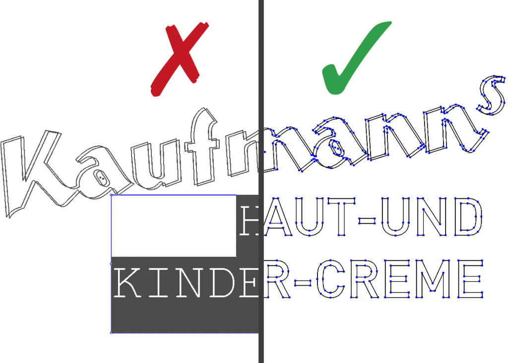
The font used must be converted into paths. Otherwise, the missing font will be replaced with a system font, meaning that the font will not be displayed correctly.
Other issues
The issues below may also occur in your data.
Format error
Permitted formats
- jpeg
- jpg
- jpe
- tiff
- tif
- gif
- ai
- eps
- ps
- ept
- bmp
- pam
- psd
File size error
Files over 500 MB in size will be rejected.
GTIN error
Does not comply with GS1 requirements.
Linked file is missing
Before forwarding images, to a pre-press company for example, you need to embed the linked graphic files, as they are not stored within the document. This means that the logo can no longer be edited correctly. The resolution of the embedded graphic file must be at least 300 dpi/cm at 100%.
Example: Linked image file missing
Images must be embedded. A linked file that is missing cannot be replaced. This results in a display error because the image cannot be loaded.
File name
- The file name must include the item’s GTIN (EAN)
- Global Trade Item Number (GTIN) = internationally valid numbering structure for the clear identification of products and services)
Color space/color profile
- RGB → ECI RGB V2, standardised RGB colour space of ECI (European Colour Initiative)
- Recommended as the working colour space for the professional processing of images
To ensure maximum colour authenticity, the colour space and colour profile must be standardised throughout the entire process. A specific colour space and colour profile for images has been defined in the Markant mediaBASE for this purpose. Use in the Markant mediaBASE – image data in RGB mode – eci RGB v2. Standardised RGB colour space of ECI ( European Colour Initiative). Recommended as the working colour space for the professional processing of images.
RGB
RGB is the colour space that is displayed using the colours Red, Green and Blue. It is used on monitors, televisions and smartphones. The colours red, green and blue are known as “light colours” and are not reproduced in print since it is not possible to mix “light colours” on printed materials.
CMYK
The CMYK colour model is a subtractive colour model that forms the technical basis for modern four-colour printing. The acronym CMYK stands for the three colour components Cyan, Magenta, Yellow and the black Key as colour depth. Like RGB colour spaces, CMYK colour spaces are device dependent and therefore require colour profiles to describe colour tones exactly. If image files are to be used in a printing process, they must be converted to the CMYK colour space. Printing does not use the principle of additive colour mixing, but instead uses subtractive colour mixing, based on the primary colours Cyan (C), Magenta (M) and Yellow (Y). In practice, overprinting of these colours cannot create a deep black so a fourth colour channel with black (K) is added.
Comparison of colour spaces RGB vs CMYK
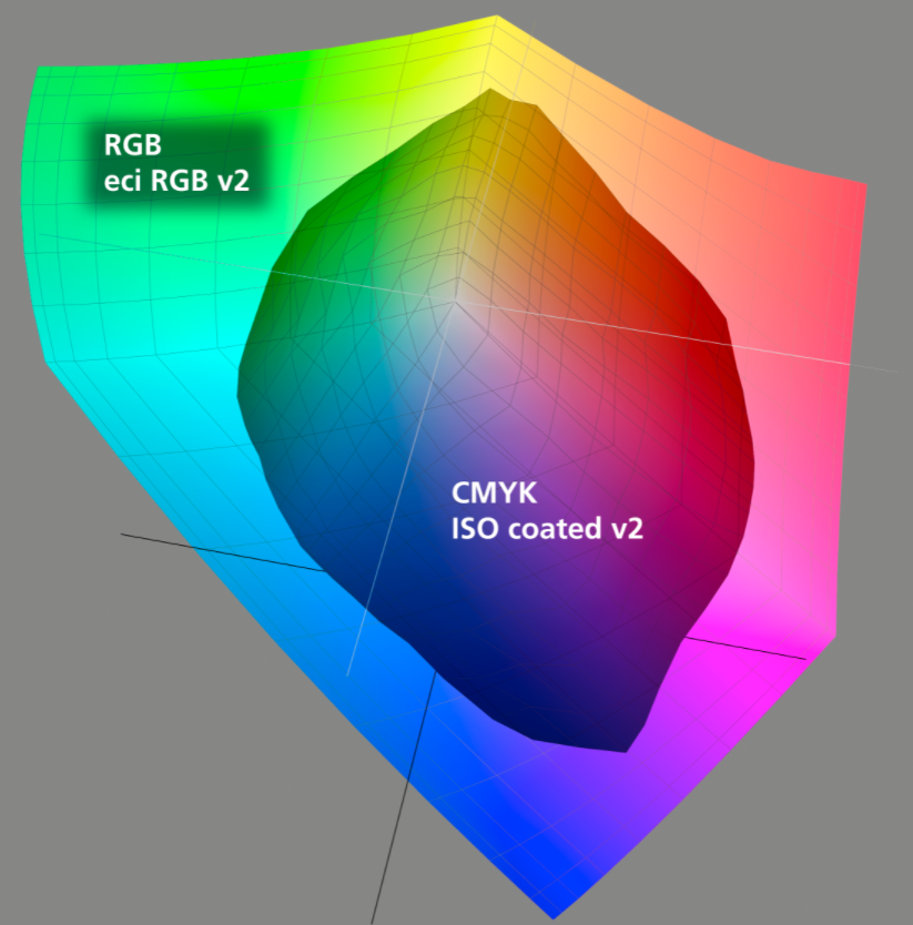
The CMYK colour space is smaller than the RGB colour space, so it can display fewer colour values – colour values are lost during conversion.
Note: The European Colour Initiative (ECI) is a group of experts working on device-independent processing of colour data in digital publication systems. European Colour Initiative (ECI)
Minimum size and resolution
Examples: poor clipping path
Product images (motif) must measure at least 2,000 pixels on the longest side (corresponds to at least 16.93 cm at a resolution of 300 dpi)
Recommendation for photo briefing
Before taking any photos, the product samples should be very carefully selected. Make sure that the samples are clean and free from damage, that there are no dents, cracks or fingerprints, and that no labels or stickers are attached. The samples should also be a typical representation of the product, with the proportions and dimensions meeting the requirements of the manufacturer. If the samples are sent by post or courier, they must be packaged in such a way to ensure they are protected and kept intact.
The front view of a product is the starting point for all other images. The front of an item is the side with the largest surface, which is used by the manufacturer to promote the product to the consumer, i.e. the side that displays the name of the product.
- No alpha channel/layers
- No rulers or reference lines
- No bubbles or dark/light areas
- No transfer function or postscript colour management
- No imprints
- No fingerprints or visible watermarks
- No distorted products
- No interpolation (enlargement)
- No scanning of printed pages
- No dust or scratches
- No artificial shadows
- Minimisation of the moiré effect
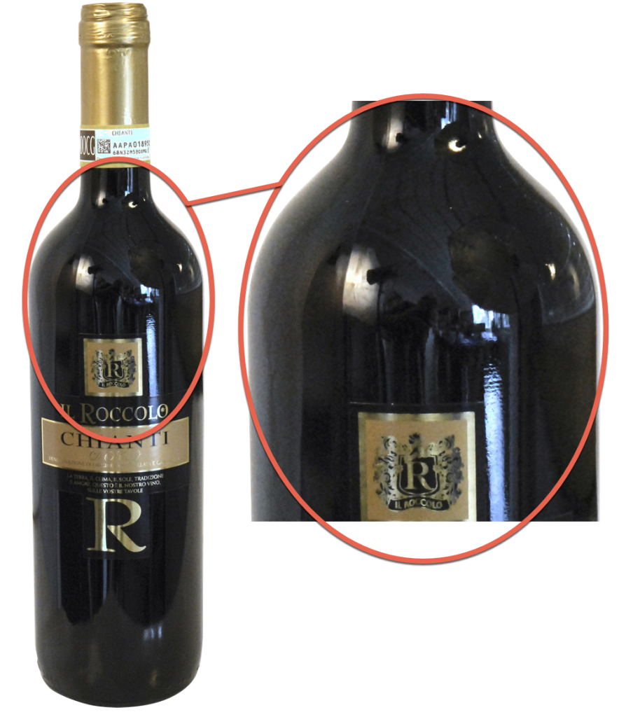
- No indication of vintage (e.g. with wine)
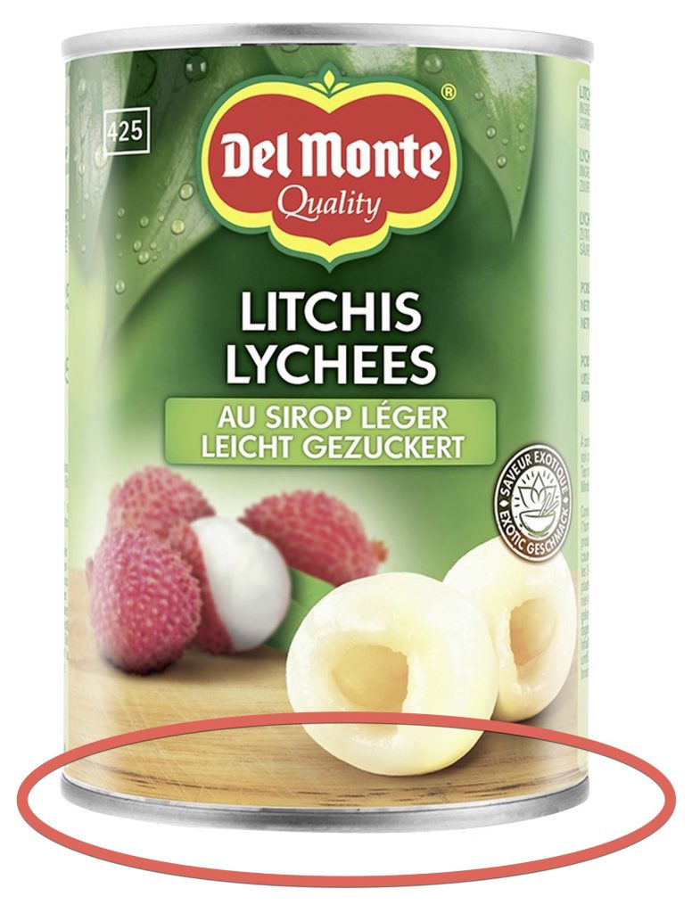
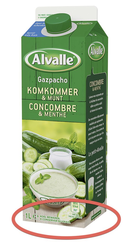
- No product-specific information such as best-before dates or batches
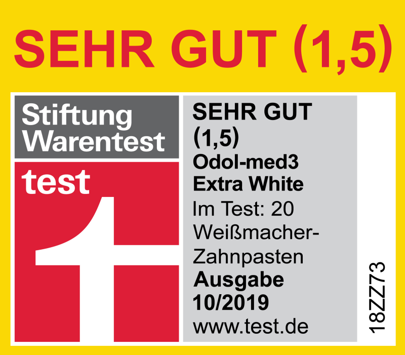
- No item-specific labels, i.e. labels that have a test number or period of validity, such as “Stiftung Warentest”, ” Ökotest”
- We recommend supplying the user with the labels in a separate graphic file
- As little reflection as possible
- No representation of proportions on single item level
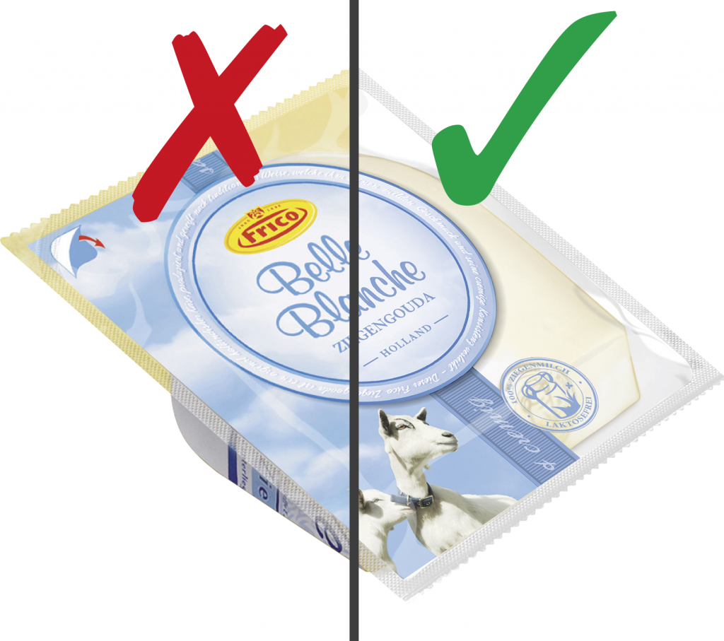
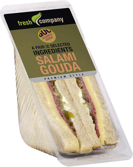
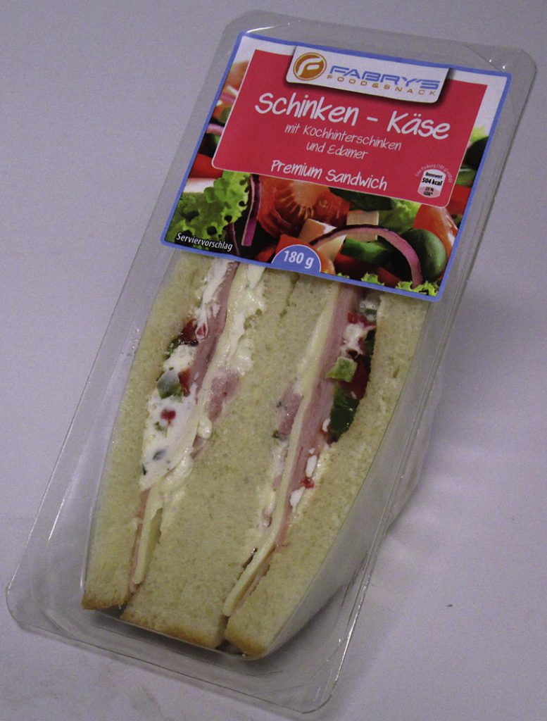
- All products are shown against a neutral background. This means that the product must be isolated from the background by using a white background. No props, tools, people or additional objects may be used in the product image. Exceptions apply here for non-food items, for which a stand-alone image will not suffice.
Poor photography
Help to ensure that media assets meet the quality requirements and support our retail partners’ marketing measures. Only media that fulfils the quality requirements can be made available via the MARKANT mediaBASE. Here we provide examples to explain potential deficiencies and give you tips on how these issues can be avoided or rectified.
Cut off
The image is not shown in full.
Examples: Cut-off images
Insufficient illumination
Images should be presented in an appealing format, with all important visual and functional details shown. Attention must therefore be paid to correct illumination.
Examples: Insufficient illumination
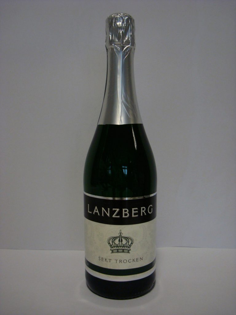
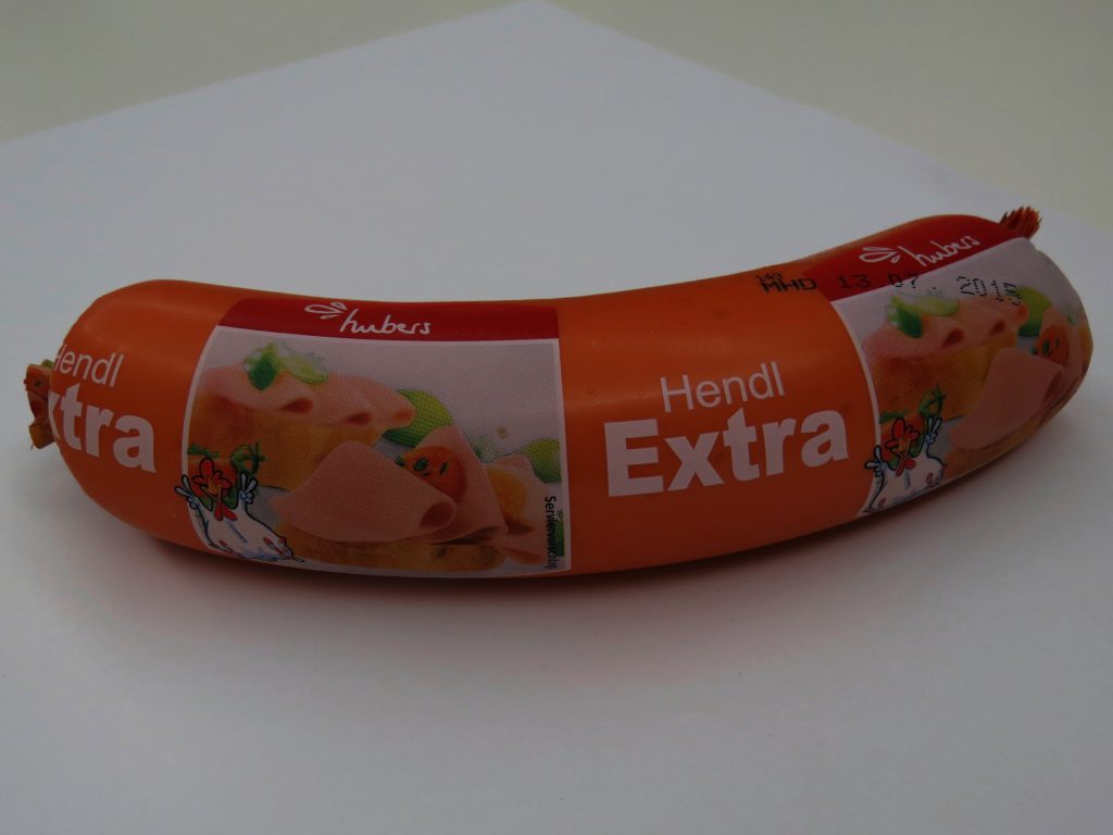
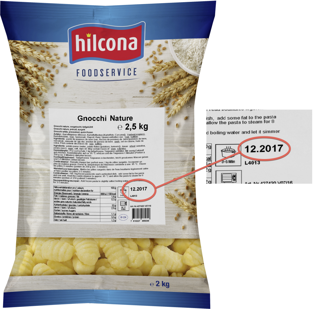
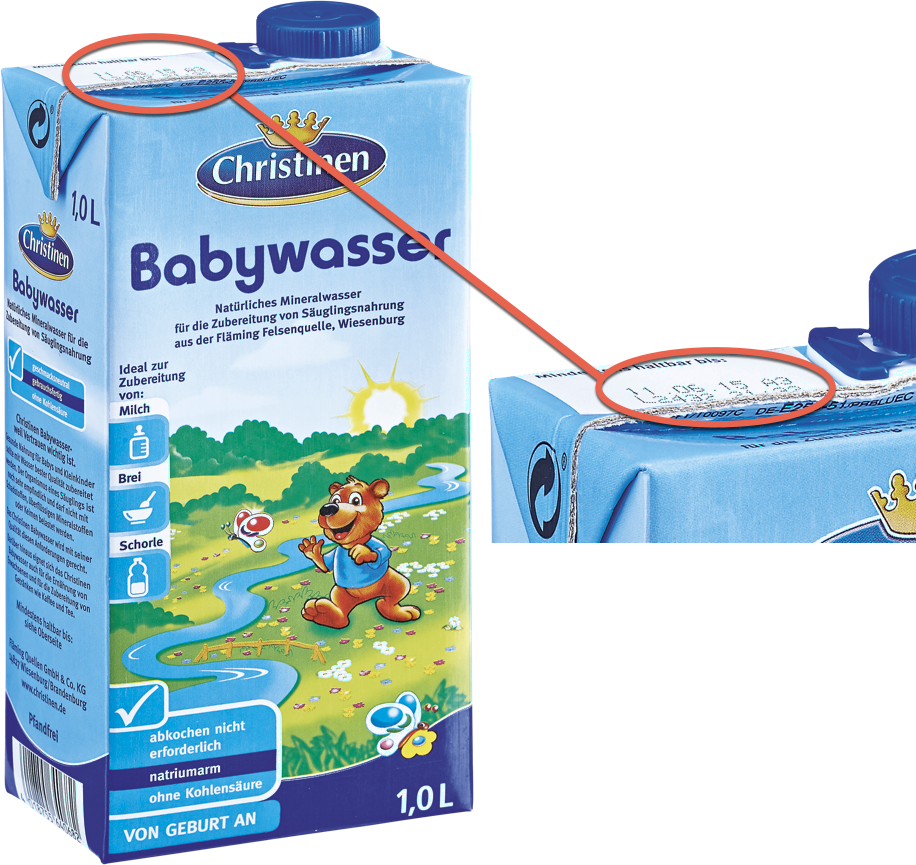
Best-before date visible
Images may not show a best-before date. This ensures that the image can continue to be used for advertising purposes.
Examples: Images with best-before date
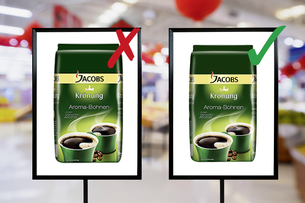
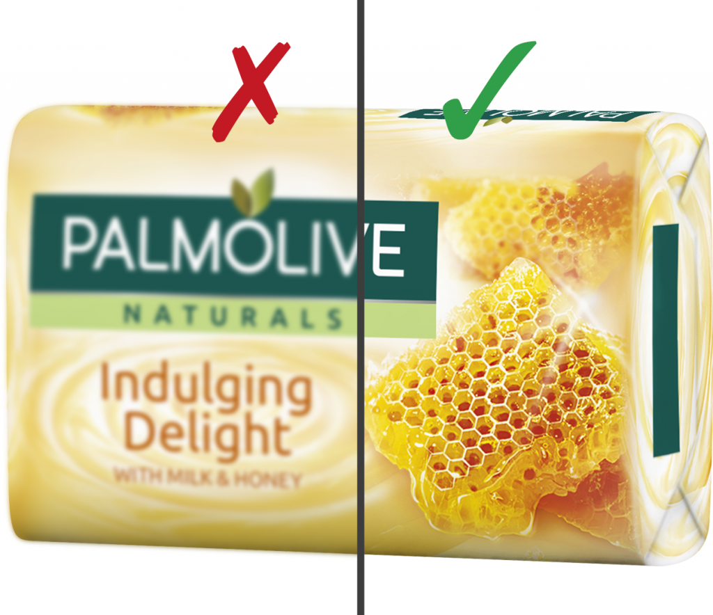
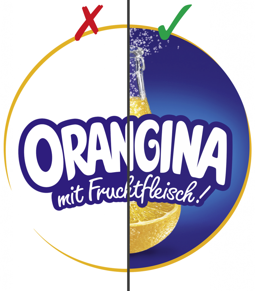
Non-neutral background
Images with a non-neutral coloured background cannot be isolated from the background because incorrect colours will be visible in the knockout.
Examples:
Images with non-neutral background
Effect of a non-neutral background
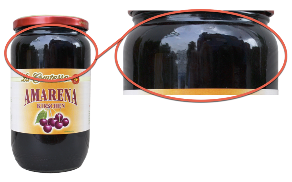
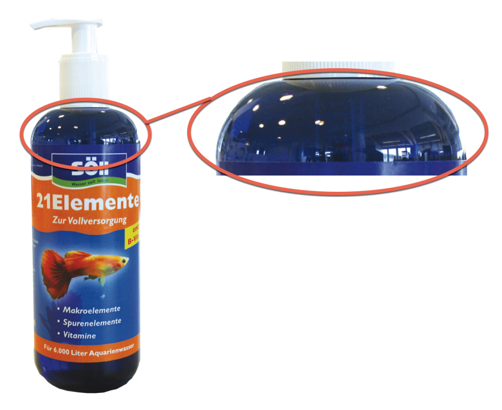
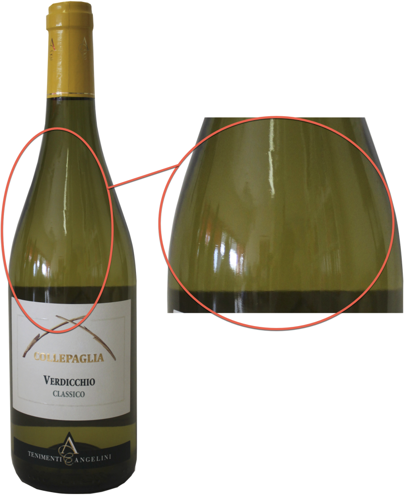
Reflection
Images with a reflection are not ideal for advertising an item because the image shows details that are not part of the item.
Examples: Unwanted reflection
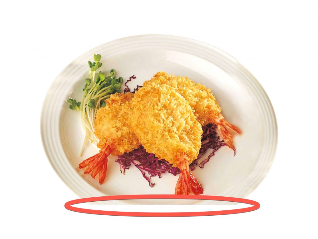
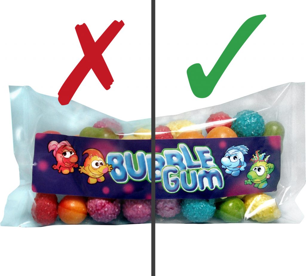
Shadows
Images must be supplied without shadows. Many programs allow shadows to be created relatively easily in accordance with the user’s own requirements.
Examples: Images with shadows
Image should be knocked out on a white background. Please remove shadows.
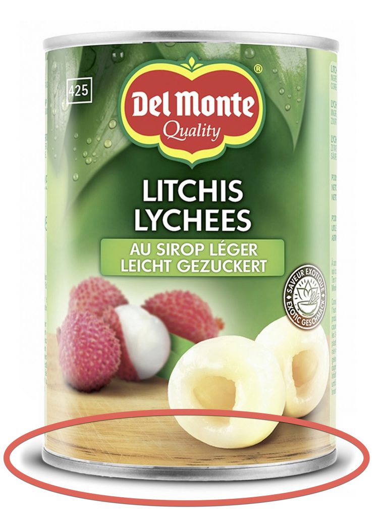
Image displayed correctly without shadows.
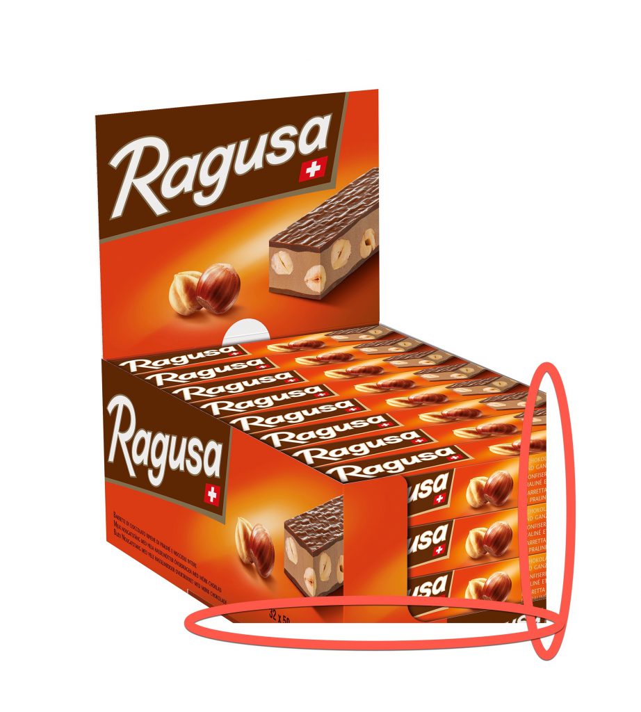
Unsuitable perspective
Images should be presented consistently. To achieve this, unsuitable perspectives should be avoided. The optimum view of a products is the side with the largest surface, which is used by the manufacturer to promote the product to the consumer, i.e. the side that displays the name of the product.
Distortion/wide angle
Avoid perspective distortions. When wide-angle lenses are used for close-up shots, perspective distortions may occur. As a result, vertical lines run together and do not accurately represent the proportions, as you can see in the following examples.
Requirements for product images and media assets
Depending on the aim, the following solutions are recommended in order to meet the requirements for modern product depictions in omnichannel marketing:
- Product images for user units incl. path cut-outs
- Product images for trade units
- Mobile-ready hero image
- Secondary images
- 360° turn of user units
- Packaging information
- Special cases
To meet these specific requirements, providing four product images optimised for advertising is recommended. The manufacturer is responsible for the final decision on which product images will be selected.
Consumer units Konsumenteneinheiten
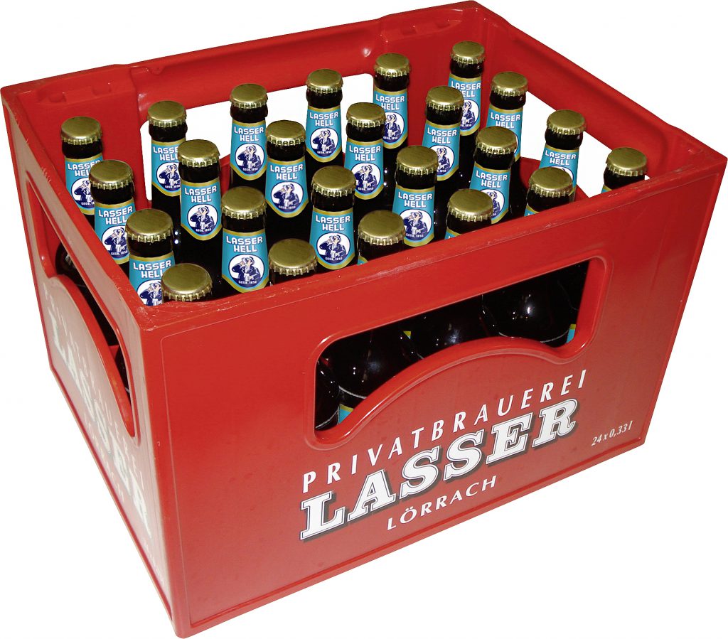
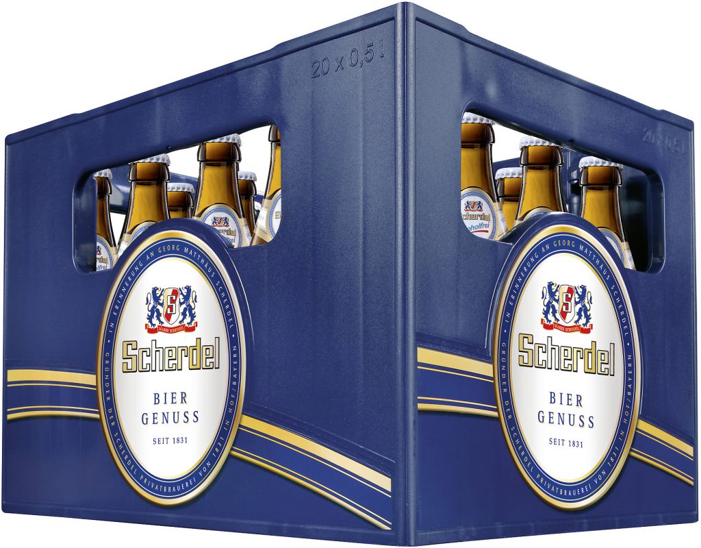
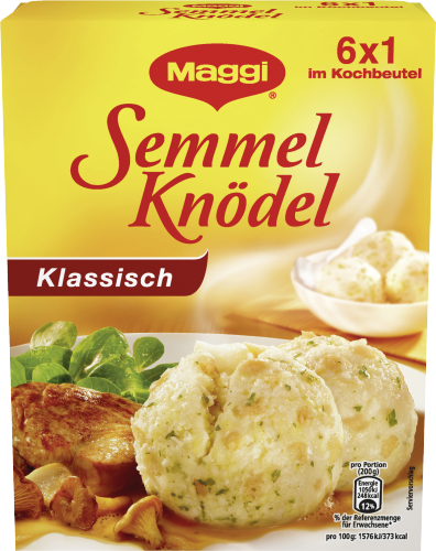
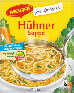
At least one image, in which the front side of the product is shown by means of a perspective view with slight top view, should be provided.
A frontal shot without perspective is recommended for planograms and products with shallow depths (eg pouch products, CD / DVD, etc.). For planograms, it is not recommended to distinguish the images in terms of quality and size.
Examples: Image of user unit
Perspective depiction of front
bottom with relevant product information
Example: Image of user unit for planograms – front without perspective
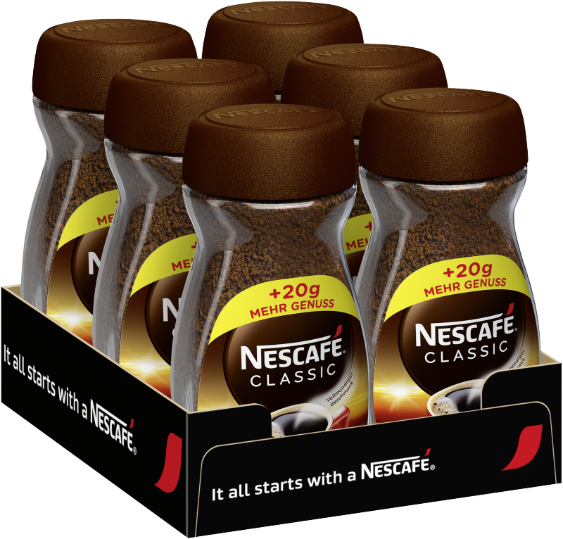
Retail units
Due to different use cases (shelving units, trays, etc.) the manufacturer defines the front view of the trade unit. Images for planograms should always be depicted with a frontal perspective. For all other applications, a perspective from slightly above at a rotation of 15–20 degrees is recommended.
Example: Product image of a tray
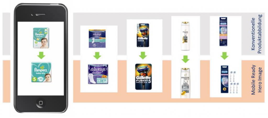
Mobile Hero Images
The mobile hero image has been specially developed for e-commerce and should be used for mobile (smaller) depiction in particular. The mobile-ready hero image is considerably simplified in comparison to the classic product image of the user unit. It is reduced to the depiction of the core product features and characteristics: product name ( e.g. Pampers Baby Dry), layout/design (green heart), version (nappy size 5) and product contents (in the Pampers size 5 saver pack there are 23 nappies). In this way, the mobile-ready image gives the user quicker product perception than the classic ‘realistic’ image.
Examples: mobile-ready hero images
Secondary Product Images
The secondary images go beyond the classic product image and show product-specific images containing further information for the consumer, or relevant features that could positively influence a possible purchase decision.
Composition
The ‘composition’ image category shows pictures depicting the products packed and/or unpacked. The illustration can consist of several single images. Products can be shown with contents / bottle / can / pen with cap closed or open. Another variant of the composition could also show outer packaging with the flask in front of it.
Examples: composition images
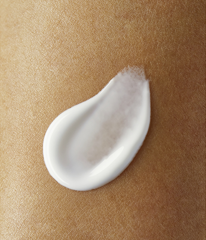
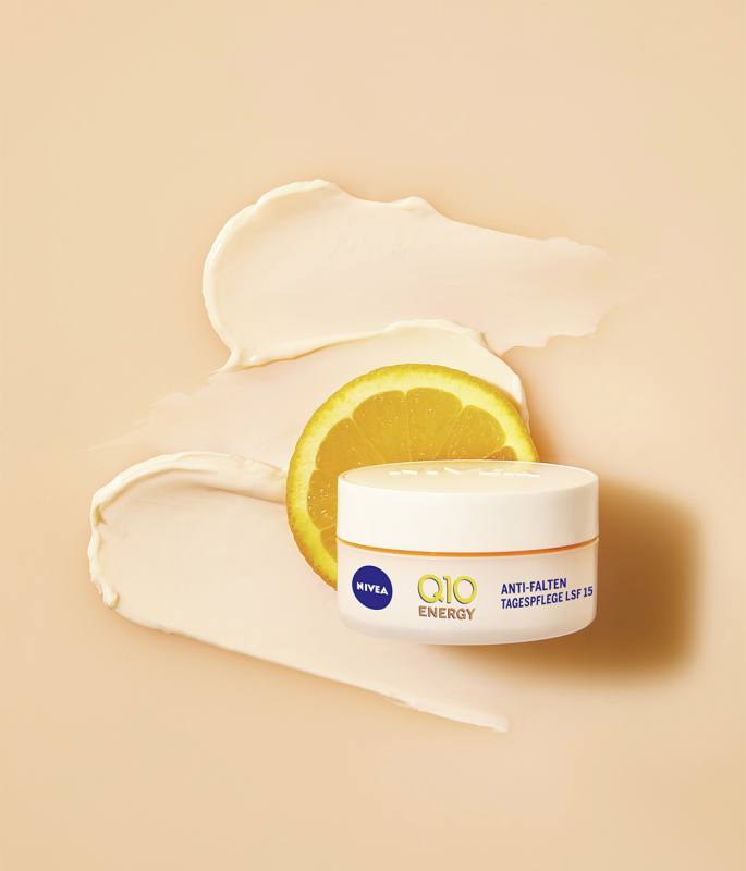
Content / Texture
The ‘content/texture’ image category shows images that depict the content or texture of a product. The image should be designed in such a way that the texture can be experienced by the end user similarly to in stationary retail, e.g. creme, lipstick.
Examples: images of content or a texture

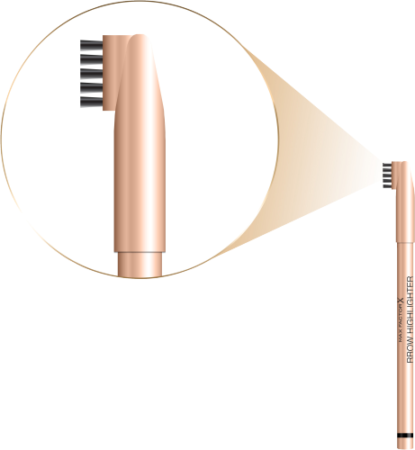
Detail
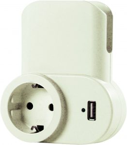
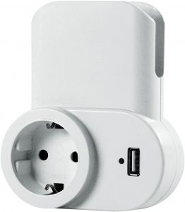
The ‘detail’ image category shows images which depict a close-up of special product characteristics, for example.
Examples: detail images
Social Media
The ‘social media’ image category shows assets with media content.
Examples: social media images


Application
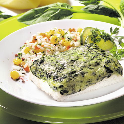
The ‘application’ image category is used to depict how the product itself is used.
Examples to depict use/application

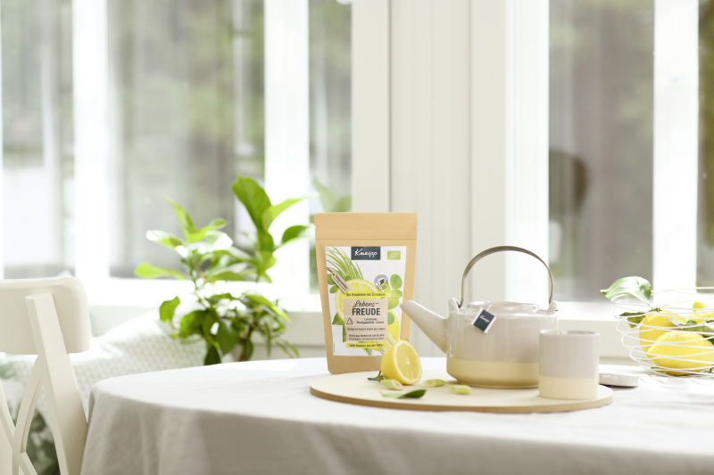
Ambience / Mood
The ‘ambience/mood’ image category shows images used as ‘mood images’.
Examples: depiction of ambience
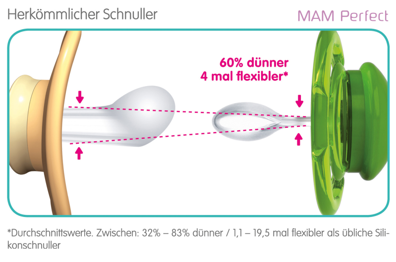
Technology
The ‘technology’ image category shows images that show the function or a special feature, such as the particular properties of a nappy, in detail.
Example: images to depict technology


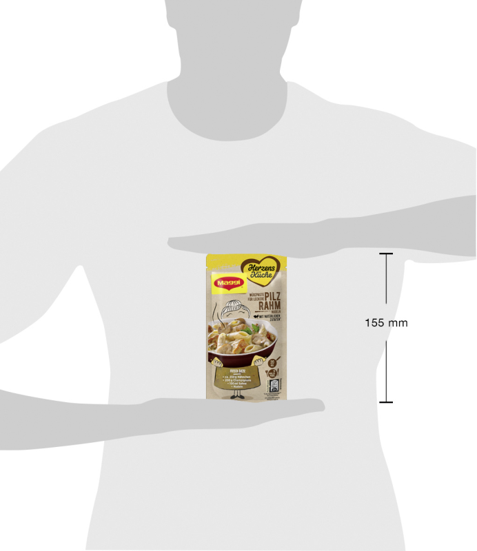
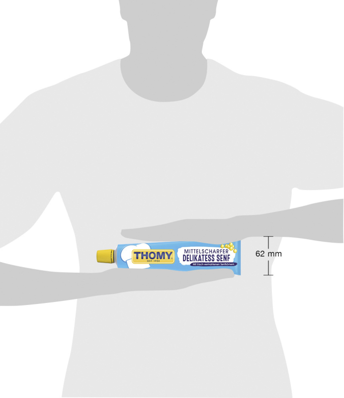
Size comparison
The ‘size comparison’ image category makes clear the actual size of the product, e.g. via a schematic depiction of a person or well-known object (e.g. one-euro coin) in the background.
Examples to depict size
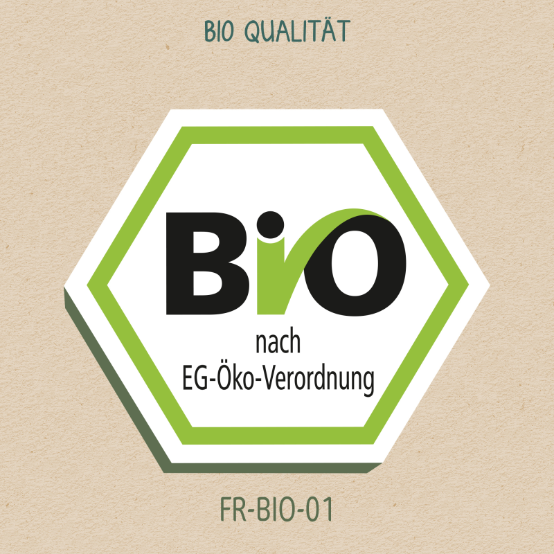
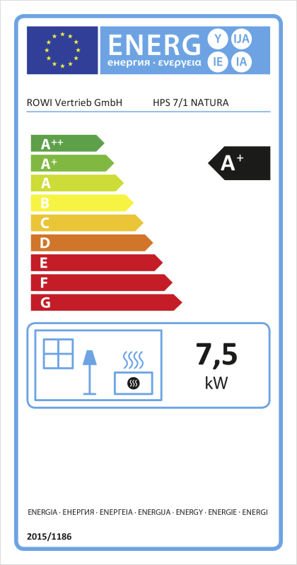
Seal
The ‘seal’ image category shows seals that can be clearly allocated to an item and are relevant for a specified time period.
Examples: seals